Purple color in the interior. Psychology of color: purple color
The color purple is fraught with mystery and incredible charm. What do you imagine when you mention it? The endless lavender fields of Provence or the twilight sky colored by the rays of sunset, or maybe delicate petals lilacs and orchids.
The shades of purple are very diverse, and many people cannot determine their identity at first glance. The combination of cold and warm components adds depth, versatility and attractiveness to the purple tone. It was not for nothing that great monarchs and rulers, clergymen turned to him when choosing the color for their festive vestments.
Classification of shades
According to the Panton standardized color matching system, there are 196 shades of purple. And if you turn to the original source, you can see for yourself that, despite the absolute similarity at first glance, upon more detailed study it becomes clear that they are all completely different. It is impossible not to note the poetic names of the shades: lilac snow, lavender mist, ice orchid, cosmic sky, crocus, thistle inflorescence, etc.
For ease of understanding, we offer you a classification according to which all shades of purple are divided into 4 groups:
- rich and deep dark purple tones: violet-eggplant, plum, dark mulberry, etc.
- Translucent, light shades: lilac, violet, thistle, pearl purple, amethyst, etc.
- Shades with red undertones: fuchsia, purple, red-violet, lilac, fandango.
- Shades with blue undertones: electric violet, dark purple, black currant, indigo, etc.
The first group of shades is the most mystical and attractive; their choice is the best option emphasize the aristocracy of the image or interior. If they are greatly diluted, then we get a second palette. It is democratic and easily complemented with other colors. The most capricious shades of purple with a red undertone are considered. They require a classic addition, light and unobtrusive. We suggest taking a closer look at how purple combines with other colors.
Shades of purple + white

This combination can rightly be called classic. Purple color in the presence of white looks noble, catchy and refreshing. Depending on the tone of the first, the strength of the contrast and, accordingly, the effect of it changes. It doesn’t matter where such a combination will be used (in clothing or interior design), believe me, it will be a win-win. Complement it with brown, black and gray tones.
Shades of purple + black

Black, like white, is appropriate everywhere and always, it is universal, and therefore can be easily complemented with all possible shades. In this case, you need to be careful with purple. Use light shades, especially those that have a red undertone; black will only emphasize their nobility, and do not use overly saturated ones (plum, deep purple). Dilute the ensemble with white.
Purple + gray

This color combination is in no way inferior to the first in terms of versatility. Shades of purple against a background of gray look calm and comfortable to perceive. In the interior, such an ensemble is especially good when decorating kitchens and living rooms in high-tech style. When choosing a combination of gray and purple in clothes, keep in mind that it the best way suitable for office dress code. The first color acts as an excellent base, and the shades of the second add variety.
Purple + yellow

Purple and yellow are a gorgeous and vibrant combination inspired by nature itself. It is for this reason that it is so harmonious for our perception. Give preference to bright or delicate yellow shades, pure, without any admixtures of gray or other colors. They most successfully emphasize the depth of purple and its richness. In this case, there can be completely different proportions.
For interior decoration, a combination of purple and yellow is usually used to create a retro style.
If we talk about clothes, then completely different proportions are in use. For example, a purple dress and a yellow handbag. In the photo you see an almost equal presence of both colors, but at the same time one of them is inferior in saturation, and rightly so.
Purple + red

Using both red and purple flowers- this is not just an unusual, but rather an extravagant combination. At first glance, it may even seem aggressive and harsh. However, even such an unusual alliance can be successfully beaten. First, we recommend that you use a light purple (lavender, lavender, etc.) with an equally strong red. Secondly, dilute the combination with a neutral color - white or light beige.
Pay attention to the photo above. The interior in purple and red colors looks very unusual, but at the same time incredibly attractive and atmospheric. This is more of a decoration for something than an everyday option.
Purple + pink
This combination can look vulgar, flashy and tasteless, or elegant, light and gentle. It all depends on which shades of purple and pink you choose to match each other. They are quite close in tonality, and therefore are perceived as something natural. Avoid “poisonous” pink when choosing flowers. Give preference to pastel shades of this color, but purple can be rich and deep.
In the interior, this combination is most often used to decorate bedrooms. By choosing pink and purple clothes, you can create a great summer outfit or even office look. This combination is also relevant when creating evening makeup. Purple will highlight green and brown eyes especially well.
Purple + beige and brown
Combination of purple and brown colors- this is a pleasant, unobtrusive, relaxing combination. When decorating the interior, it will be appropriate in any room (bedrooms, living rooms, kitchens). In addition, brown perfectly harmonizes the purple shade in combination with other colors, literally “grounding” the bright design and making it calmer.
A similar duet is also appropriate in clothing. The image looks especially beautiful when the violet-gray color, or blueberry, is combined with shades of chocolate. Its combination with beige is no less attractive. Violet with such a “companion” becomes more balanced, gentle and light.
Purple + green

These two colors are contrasting and opposite. Being in interaction, they further enhance the beauty and brightness of each other. This combination is more than often found in nature. It will look good in any proportions: from rich and deep to delicate and pastel colors. Mint green and lilac, apple and purple are often used in interiors. A bedroom or living room decorated in this way looks stylish and original. But we do not recommend combining green and blue-violet; it is better to use pure shades, without undertones.
Purple + metal (gold, silver)
We have already mentioned that since ancient times the rich violet color scheme was used for the clothing of emperors and kings. In this regard, the addition of all its shades with something metallic will be very important. These can be large accessories (bags, belts, belts, etc.), jewelry, shoes. The shine of silver and gold will highlight the nobility of purple shades.

Combination of shades of purple with each other
Combination of shades within one color range- this is something that everyone can afford. At the same time, you should remember one simple rule: do not combine cold and warm shades in one set. Well, then everything is at your discretion.
A set entirely in one tone is boring, so combine two or three tones of different saturation. For example, if you choose a deep blue-violet color as a base (suit, dress), then highlight it with a lavender or lilac cardigan. A blueberry sweater would look great paired with a light purple skirt or trousers.
Purple is the last color in the rainbow and color wheel due to the fact that human eyes are not able to see shorter radiations. At the same time, purple is the result of the fusion of complete opposites - red and blue.
Purple is the most difficult color in the rainbow. In ancient times, it was believed that a violet flame descended from heaven to Earth, which in its significance was higher than ordinary white light. People valued shades of purple, but not everyone was worthy of this color, because previously, dyes of similar shades were rare and very expensive.
Perhaps this is why many properties are attributed to it. Violet helps people with certain diseases, as it has the ability to calm. He is also credited with the ability to improve and restore vision. People suffering from myopia need to continuously look at this color for 10 minutes a day, and their vision will improve.

In addition to helping in the fight against diseases, purple helps in the spiritual struggle, protects against dark forces, and bestows supernatural abilities. This color also has a connection with intuition and helps to blur the boundaries between the material world and the world of subtle energies. Perhaps this is why purple is considered the most mystical and mysterious color. Let's look at photos of the most different manifestations of this beautiful color and think about the benefits it can bring to our lives.

If you're tired of wearing your favorite and tried-and-true shades, try creating an outfit in purple or at least adding shades of it to your accessories. This can have a positive impact on the subconscious, mood and various areas of our lives.
Purple color is usually classified as a “cool” shade, but in reality it’s not that simple. Ideal pure colors can be found in the pictures. All colors flow into one another, therefore, in clothes and accessories, the color purple can have both cold and warm shades. This must be taken into account when creating new image.

Girls with a warm color type of appearance should choose clothes with warm shades of purple. Also keep in mind that the material can change the temperature of the shades. Matte, suede texture gives things warmth, while shiny materials make colors cooler.

In psychology, the color violet represents the complete unity of opposites and negations, until they completely dissolve into each other. As we already know, purple appears due to the fusion of opposites - red and blue. This is probably why purple is so mysterious and magical.
Psychologists are trying to show the whole world how deeply they understand the human soul and the essence of existence in general. But in fact, most psychologists are not satisfied with their own lives, but they will never admit it, because then there will be few people willing to listen to their instructions and pay for consultations.
Therefore, you should not take psychologists’ statements about the color purple too seriously. Some of them claim that homosexuals adore this color, others attribute the craze for purple dresses to sexually dissatisfied women or pregnant women. Some recommend this color for teenagers, while others, on the contrary, categorically prohibit dressing children in purple.

When it comes to achievements and lifestyle, the opinions of psychologists are again divided. Some argue that purple lovers often achieve high goals in life, while others, on the contrary, argue that purple is the choice of losers from the very bottom of society. I don’t know where this theory came from, but I have never met the dregs of society in .
Purple – the color of the unity of opposites , which is why there are so many contradictions associated with it. We must not forget about the variety of shades, which means that it is more correct to consider its meaning in psychology based on a specific shade. Dark shades symbolize power and strength. Light shades, on the contrary, are soft and delicate...
All people are different, but most likely the color purple is loved by individuals who are receptive to the spiritual, non-material world. And people are pragmatic, living exclusively material assets and by calculation, they reject shades of purple.
Psychics and people of holy life can see much more than a worldly person. For example, they can contemplate a person's aura, which is the glow of energies around a person. If there is a lot of violet in the aura, it means that a person has a pure soul, free from worldly vices and passions.
Now most of us do not see the aura, but the day will come when the soul is separated from the body and all our deeds become visible, then we will see our soul and will be able to check how true the statement about the divine origin of violet is.

Purple eye color
Unfortunately, in nature it is impossible to meet a healthy girl with real purple eyes. You can insert lenses, correct the photo with the almighty Photoshop, but real purple eyes are incredibly rare and are the result of some deviations. Militta has already talked about how eye color is formed in...
Hair coloring in purple shades
With the help of modern dyes, any girl can transform her appearance and dye her hair purple. Just before you decide on such a transformation, you need to define your expectations, because the resulting shade depends on the original hair color and dye.
They never go out of fashion in clothing and interior design. Some experts even say that this color can become a real symbol of the 21st century. What is the reason for such popularity? In the complexity and special expressiveness of purple. He can be discreet, bright, mysterious, sexy. But what does purple go with? The answer to this question is not always simple; this color requires color sense and courage in decisions. Let's talk about how to combine purple in the interior and clothing and how to find unusual combinations.
Features of purple color
To understand what it is combined with, you need to determine its specifics. It belongs to complex colors; depending on the shade, it can belong to the group of colors of the second or third order. Purple is made by mixing red and blue. To obtain a dark, intense tone, a drop of black can be added, which complicates the color to the third level. Purple is a non-spectral shade and is the shortest monochromatic cure.
All this makes it difficult to select harmonious combinations and difficult to perceive by the human eye. Purple, depending on the predominant tone, may be closer to the red or blue range, but in any case it is considered to belong to the cold color group. This complexity of color leads not only to difficulties in combining, but also to problems with naming shades and with their perception by humans. Often people who are not involved in colorism have difficulty distinguishing the nuances of shades of this color.

Names and shades of purple
The question of what color goes with dark purple or light purple has different answers. Since this color has many variations. IN English language There are two words for this palette: purple and violet. There are also several traditional names in Russian different shades purple. Artists believe that this color differs from the purple and lilac range, but everyday ideas often do not capture the color nuances; we call it all purple.
In attempts to denote the difference in shades of purple, names such as amaranth, violet, eggplant, plum, fuchsia, magenta, orchid, lavender, lilac, heliotrope, and amethyst were introduced. And also such gradations as light and blue-violet. All this verbal diversity still cannot cover the infinite variety of nuances of this color.

Principles of combinations
People often wonder what colors go with purple in the interior. To answer this question, you need to understand that there are combinations based on the principle of direct contrast, there are adjacent pairs, and there are complementary combinations (i.e., indirect contrast). Also, to create a color pair, you need to take into account the intensity and warmth of the shades. In addition, there are also accent-type combinations, when one color, for example, purple, is only a bright detail on a neutral background, and monochrome compositions, when tones of one palette of different intensity and saturation are combined.

Symbolism of purple
This complex color has equally complex symbolism. In European culture, purple has been a symbol of the Catholic Church for many centuries. It was also the color of grief, mourning and widowhood. This was due to the fact that deep mystical experiences were attributed to the color violet. It is associated with mystery, self-knowledge, depth of sensations. In modern culture, purple is a symbol of creativity, harmony and balance. It has a dual effect on the human psyche: it excites and calms at the same time. Purple today is considered a symbol of freedom, sexuality, and inspiration.
Purple color in the interior
Common people believe that purple is too heavy and expressive for the interior. But the designers answer that it’s all about proportions and shades. For a sunny room, it is quite possible to decide to decorate the walls with this color, but in other cases you can use this color only in the details. So what colors go with purple in the interior? Primarily white. This pair creates a graphic formal combination that is suitable for both the living room and the kitchen.
The second harmonious “partner” of purple is gray. Such combinations look very soft, the main thing is to find a balance in warmth and intensity. Brighter and more unusual combinations of expressive violet with pistachio, light turquoise or lemon are suitable for decorating bedrooms, dining rooms, and public areas. In such pairs, it is important that one color be lightened, pastel, so that there is not much strain on the eyes.

Purple color in clothes
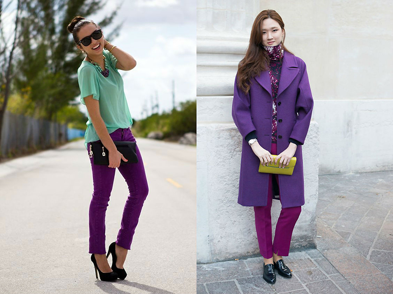
Fashionistas often wonder what the color purple goes with in clothes. This expressive color requires careful selection of “companions”; their choice is determined by the objectives of the set. If you need to stand out, then you can safely combine violet with yellow, orange, and turquoise. If you want to look neutral, then you should take a closer look at blue, gray, beige as the base colors, and make accessories or one item of the set purple. For example, sand trousers and a top will be perfectly complemented by a purple jacket. A bright blouse or scarf will be a great addition to jeans. But purple total looks are the choice of only the most daring ladies, as are dramatic combinations of purple with black or red.

Bright combinations
If you decide to put together a bright set for your room or clothes, you should think about what the color purple goes with. Yellow and green will be contrasting and complementary to it. When creating pairs, you need to balance the shades well in terms of warmth so that you get a clean combination. It will also add brightness and expressiveness to purple White color. Violet looks great with turquoise and bright emerald.
Harmony and restraint
When the task arises of creating a neutral set, the question of what the color purple goes with becomes even more difficult. Shades such as camel, mustard, and denim will help dim the brightness of purple, but not reduce its expressiveness to nothing. A pair of violet and steel-gray shade has already become classic. Black with purple details looks very strict. White with amethyst accents looks strict and festive.

Unexpected decisions
When looking for unusual combinations, it is worth remembering the rules of balance in the warmth and intensity of “companion” colors. In addition to the already mentioned, familiar color “partners,” shades of purple are combined with colors such as coral, warm yellow-orange, apple green, and blue. There are many options, purple gives a lot of scope for experimentation. It’s relatively easy to put together paired combinations, but it’s incredibly difficult to put together a palette of three or four shades into harmony. Since in this case you need to take into account many nuances. For example, a lilac background in a room can be skillfully diluted with white or gray and made brighter with green or yellow details.

Most often, only experience can answer the question of what the color violet goes with. The designers' recommendations concern mainly measures. You should not overuse this color, as it evokes quite strong emotions. Experts do not advise combining purple with brown, as the combination is too depressing. You should be careful when combining red and purple, as such a straightforward contrast can look rough and provocative. But in any case, this is a matter of taste and sense of proportion.
Many people like the beautiful and slightly mystical purple color. It is recommended to use clothes in purple shades for people who want to make their image original and stylish. The color purple is especially often used for evening wear, as it looks luxurious.
Subconsciously, the color purple is perceived as a symbol of spirituality, dignity, and balance. Psychologists claim that contemplating the color purple helps fight depression and allows you to achieve psychological balance.
People who like purple clothes tend to be emotional, sensitive and delicate. But those who don’t like purple at all are pragmatic, don’t like to dream and prefer to live for today.

People who are prone to a romantic perception of life especially appreciate light shades of purple. And here dark colors This color is liked by people with developed intuition.
Girls should know that purple clothes have powerful sexual energy. That is why many fatal beauties choose it for their toilets.
Color in fashion history
Purple is a complex color that combines the sacredness of blue and the solemnity of red. People learned to obtain purple pigment back in ancient times, using the shells of a certain type of mollusk. Purple dye was very expensive, so for centuries only the rich could buy clothes of this color. Therefore, there is an opinion that purple is a color that symbolizes power and aristocracy.

Only in the 19th century, thanks to the development of chemistry, purple fabrics became available not only to a select few, but to everyone. Clothes in lavender, lilac, and heather shades have become incredibly popular. The 50-60s of the nineteenth century even went down in fashion history as the “lilac” decade.

In the twentieth century, the color fell out of favor and then became popular again. So at the beginning of the century, purple clothes were considered the lot of older ladies; young girls chose other shades. But over time, fashion designers stopped being afraid of purple, especially since it is presented in a huge variety of shades.
Having traveled a difficult path in the history of fashion, the color purple has firmly established itself on the catwalks. Today it is often found in fashion collections.
Who is it suitable for?
It is difficult to say who suits or who absolutely does not suit purple. Everything will depend on the chosen shades and natural data.

- Dark-haired women The rich tones of purple are incredible; they will highlight an even tan and a bright appearance.
- Rich tones of purple will look great on blondes, but only if they have tanned skin. If your skin is pale, then the bright purple color of your clothes will give it a deathly tint.

- Dark-haired And white girls should choose cool shades of purple, they will look charming in them.
- And here red-haired And fair-haired girls With pale skin, purple is recommended to be used only as accessories. They can choose neckerchief, hairband or shoes in a soft purple hue.
We combine
Not every girl will decide to create a monochromatic image in purple, so it’s worth figuring out what tones purple goes with.

- With white. This duo looks flawless. It can be used for special occasions and regular walks. Using this combination, you can visually correct physique flaws. So, if your hips are wider than your shoulders, then you need to wear a purple bottom with a white top and vice versa.

- With black. This couple looks more stern and a little mournful. It can be used in evening looks, and for everyday looks with black it is better to combine light shades of purple.

- With gray. This is a great combination for an everyday look. Even if the gray-violet set is made up of things of the simplest order, it will not look boring.

- With green. This is a contrasting combination that can look both sophisticated and tacky. Everything will depend on the ability to combine things and not overload the image with details. One color should be the base color, and the second is used for accents.

- With turquoise. The color of turquoise goes well with the delicate violet shade of purple; this duet will be especially good in summer outfits.

- With yellow. The combination of purple and yellow will look harmonious if you choose shades that are harmoniously combined in temperature. Warm tones of purple should be combined with warm yellow.

- With orange. This duo is quite bright, so it is recommended to turn it into a trio by adding another neutral color.

- With pink. When creating feminine outfits, a combination of pink and purple is good. It is recommended to use a violet or lavender shade of purple in combination with delicate shades pink.

- With red. The combination of rich purple and red is adored by vamp women; this duet allows you to create distinctly sexy images.

- With blue. The duet of blue and purple is suitable for everyday looks.

- With beige. This combination will be chosen by feminine and soft people; neutral beige will mute the aggressiveness of purple.

- With brown. The combination of purple with different shades of brown is suitable for everyday wear.
Fashionable looks
Purple things are appropriate in almost any look. Exception - business style in companies with strict dress codes. If management is loyal to appearance employees, then you can use light shades of purple in office clothes. For example, you can wear a soft lilac blouse with a dark blue skirt or trousers in the shade of dark chocolate.
Only purple
A monochrome look in purple looks extremely impressive. But things need to be combined correctly. You shouldn’t wear clothes of the same tone from head to toe; it’s better to combine things in different shades of purple.

The combination of rich purple and delicate lilac looks harmonious. If the purple set looks too boring, then you should dilute it with accessories of a similar tone, for example, a pink scarf.
Everyday looks
Bright purple trousers or jeans can be a basic element of your everyday wardrobe. You can wear them with T-shirts, fitted shirts, romantic blouses, formal tops. A jacket or cardigan will complement the look. Additions can be chosen in pastel or neutral monochrome tones.
To create a youthful look you can wear a green dress with a purple jacket. It is better to choose accessories for such an ensemble in a neutral tone, for example, silver-gray.

For a purple dress for everyday wear, it is better to choose light shades. You can pair it with neutral or colored accessories, depending on your mood.
It may be purple outerwear. So, a bright purple coat will allow you to do autumn wardrobe more interesting.
Evening looks
Purple is a great color for evening dress. The main element of the image will be a bright dress; its style can be any, but it is better to give preference to models simple cut. You should choose expensive fabrics - velvet, silk, satin, lace.

To add a touch of sophistication to your look, you should complement your toilet with white or yellow metal jewelry. Looks elegant purple dress, complemented by a pearl necklace.

Look elegant evening looks, in which only one element is purple, for example, a blouse. To complement the blouse, you can choose silver trousers made from fabric with a metallic effect.
Rules for applying makeup
Makeup for outfits in purple shades should be feminine. You should give your skin a light tan and, of course, try to hide imperfections.

Shadows are selected to match the color of the iris. Blue eyes It is worth shading with purple-pink shades, and brown ones should be emphasized with beige-silver shades. If your eyes are highlighted, then neutral lipstick should be applied to your lips.
Choice of stars

Mysterious and mystical purple is often chosen for evening and special occasions. Movie and pop stars are no exception. Thus, at the 2016 Oscars, Heidi Klum appeared in a lush lilac chiffon dress, decorated with flowers.


Combination lilac color exotic and mysterious, the impression of them depends on its shade. For your attention, 6 palettes with 16 colors + a selection of shoes.
Lilac and beige
Lightness, grace and unclouded image. The purer and warmer the shade of beige, the more sophisticated the pair will look. Shades with orange, pink, yellow undertones are suitable, but gray, cloudy, dark colors It is better not to combine with this shade. Gold would be a good addition to such pairs.


Lilac and brown
Pairs with light yellow-brown tones will be spectacular; the contrast in the colors will be enhanced by white or darker shades: chocolate or chestnut. Combinations with dark brown colors are more strict and also require the support of light tones: white, barely beige, pale gold. This is how harmony is maintained.


Lilac with red
Bright, catchy combination. It amazes with its juiciness and unprecedentedness. It requires an ideal light, warm appearance with high contrast. To give individuality to such a forgivable pair, various additional tones are added to it: gold, green, black, blue.


Lilac with orange
An equally bright pair, but you can mute the influence of orange in it: by reducing its amount or reducing its brightness, but at the same time maintaining its purity. So the light tones of coral very nicely emphasize the freshness of the main tone. You can complement the pair with cold green, black or gold.

Lilac with pink
Bright shades of fuchsia interrupt the main tone, and it can easily become only part of the pink range. But soft, light pink tones, close to beige or flesh pink, make up a very pleasant pastel range, where the color of lilac does not move to the background, but rather comes to the forefront. The palette can be diluted with gold, beige, blue.


Lilac with yellow
First of all, it is the color of lilac and gold - an ideal combination: moderately bright, rich, but not pompous. Other shades of yellow seem to illuminate the main tone, and since the pair is built on additional contrast, its expressiveness is always at its best. To add light accents and shade the main color, use white, blue, gray.


Lilac with green
The more shrill and lighter shade green, the more attractive the tones look together. Warm tones bring softness to the palette, but combinations with cool green are truly aesthetic. Mint shades transform the main color so much that it has become a favorite along with gold.
Dark emerald or malachite tones enhance light contrast, rarely stand alone, but can set off the mint-lilac tandem.
In general, complementary colors to the combination are gold, pink, blue and dark purple.


Lilac with blue
If you notice, often the additional color in the combination is blue. This shade is very similar to the main one, and their slight difference adds up to a fresh, light look that can always come to the rescue in creating a highlight. Together they resemble a light haze, mysterious, pleasant and attractive.
Lilac and blue are a rare pair, as they are completely replaced by blue-lilac inspiration. And sharp contrast only harms the main tone.


Lilac with purple
The color siren is a separate branch in the variety of purple. Purple, eggplant and just deep purple shades can transform our tone quite effectively. Especially if you add white and black to it to deepen the contrast.
 Military pensioners for Russia and its armed forces
 What is Brazilian hair straightening
 The nuances of re-registration of a car: can a husband sell a car to his wife?